

Responsive Design
You can define which columns to show or hide based on screen resolution. Currently it uses following starting breakpoints.
xs - Extra Small devices (320px)sm - Small devices (544px)md - Medium devices (768px)lg - Large devices (992px)xl - Extra Large devices (1200px)By default it will auto hide columns from end based on screen size.
$opt["responsive"] = true;...$g->set_options($opt);To override and make a column visible on small devices and above, you can set:
$col["visible"] = "sm+";Complete column settings will be like following:
$col = array();$col["title"] = "Id";$col["name"] = "id";$col["width"] = "20";$col["editable"] = false;$col["visible"] = "sm+";$cols[] = $col;You can also specify certain screen sizes for a column. Following column will be shown on XS, SM and MD screen sizes.
$col["visible"] = array("xs","sm","md");You can always show/hide certain columns by Column Chooser.
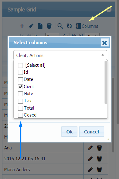
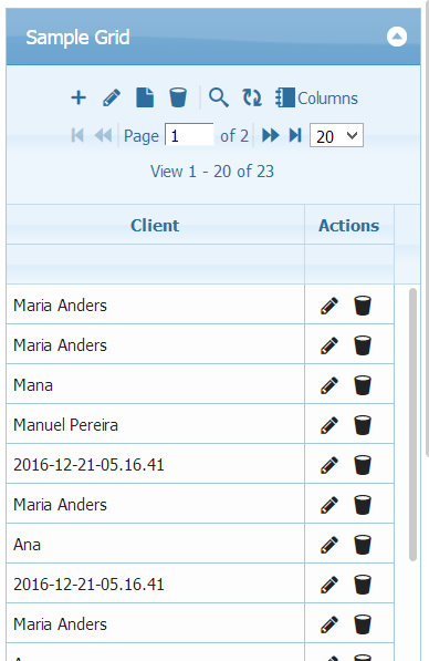
Below small devices screen sizes, It changes operation toolbar to 3 line toolbar.
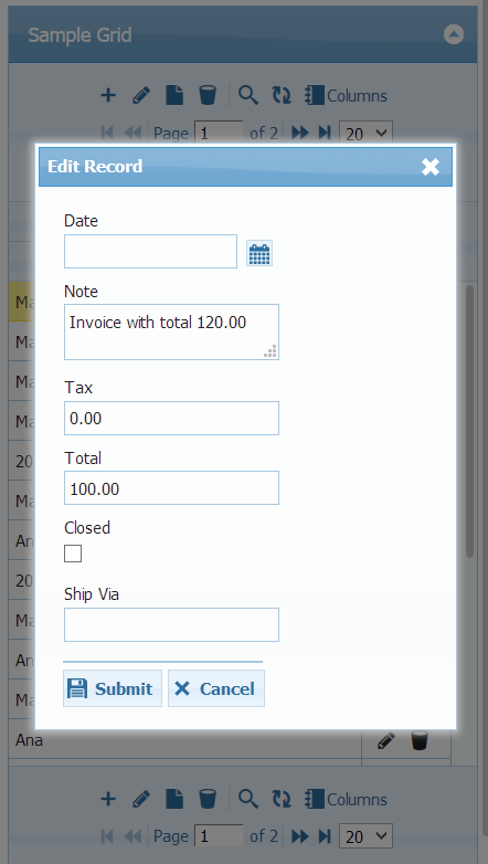
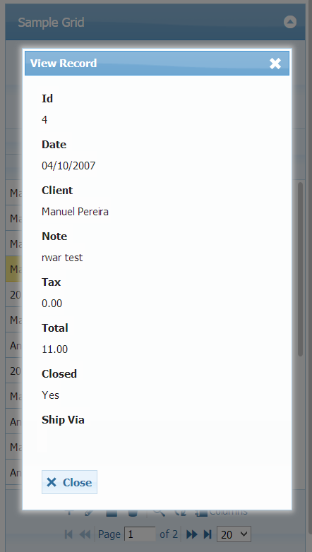
And display of add/edit/view dialogs are transposed as well.
Resources
Section titled “Resources”See Live Demo
- You can check this demo in archive
demos/appearance/responsive.php